
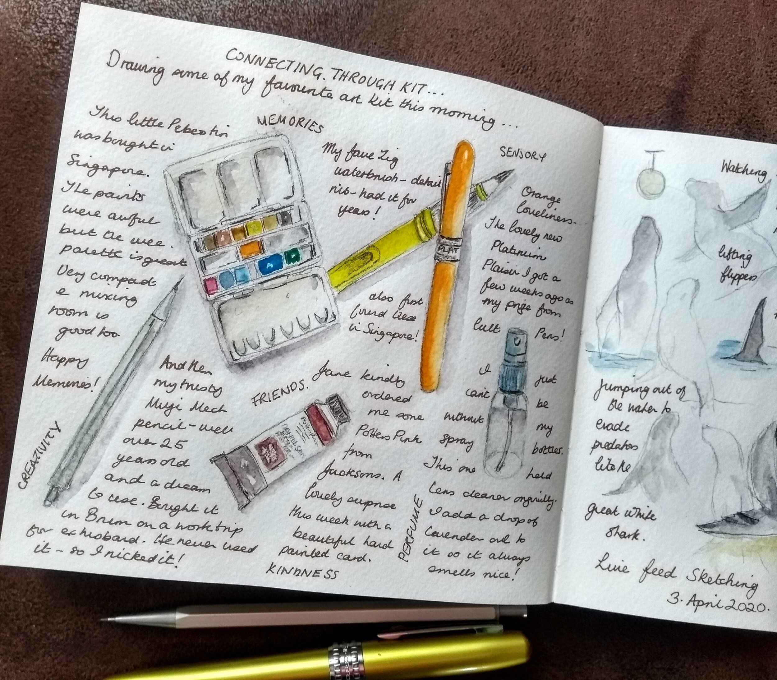
My Nature Journal Kit
/I’ve been asked if I would write some practical posts, and information about my sketching kit and supplies, so here goes!
My top tip if you’re starting your nature journal journey is; don’t rush out and buy loads of new supplies. Look around and see what you have at home first, and try out different media. You may be surprised. My favourite mechanical pencil is a metal one I bought for my husband, which he never used. I tried it out, fell in love and snaffled it, and I’m still using it every day, 20 odd years later!
My favourite things are these:
Journal - a Moleskine watercolour sketchbook (21 x 13 cm or 8 1/4” x 5”) It’s portable, and can be used a double page spread. I prefer a hardback, bound journal as I often work across the page. The Moleskine paper just suits my hand. It has a cold pressed, (NOT) surface, so it’s slightly textured.
mechanical drafting pencil with 2B lead - really versatile.
8B water soluble graphite pencil
watercolour paint
On the move - waterbrushes (detailer, medium and large)
At home - brushes: Size 6 and 8, pointed round
kneadable eraser
fountain pen for writing
small spray bottle for spritzing my palette.
rag - for wiping, blotting and lifting out!
Sometime I use watercolour pencils, too.
I love art supplies, (who doesn’t?!) but, as I’m trying to live more lightly, I don’t buy them very often and mainly replace what I use up.
When I started journaling, I used watercolour pans but now refill my palettes from tube paint. (I refill as much as possible, paint, ink, and pencil leads.) I have a large palette for the the studio, and a small palette for field work. As I work on a small scale I don’t use a great deal of paint, but I do like the versatility of tube pigment.
This is just personal preference, and something I’ve come to over time - there are no rules! I do use others from time to time, and vary my palette through the seasons. These are my go-to colours/pigments (all from Daniel Smith).
Raw Umber PBr7
Raw Sienna PBr7
Burnt Sienna PBr7
Ultramarine Blue PB29
Cerulean Blue Chromium PB36
Hansa Yellow Medium PY97
Quinacridone Rose PV 19
Transparent Pyrrol Orange PO71
Potter’s Pink PR233
Bloodstone Genuine
and the wonderful mix of
Shadow Violet! PO73, PG18. PB29
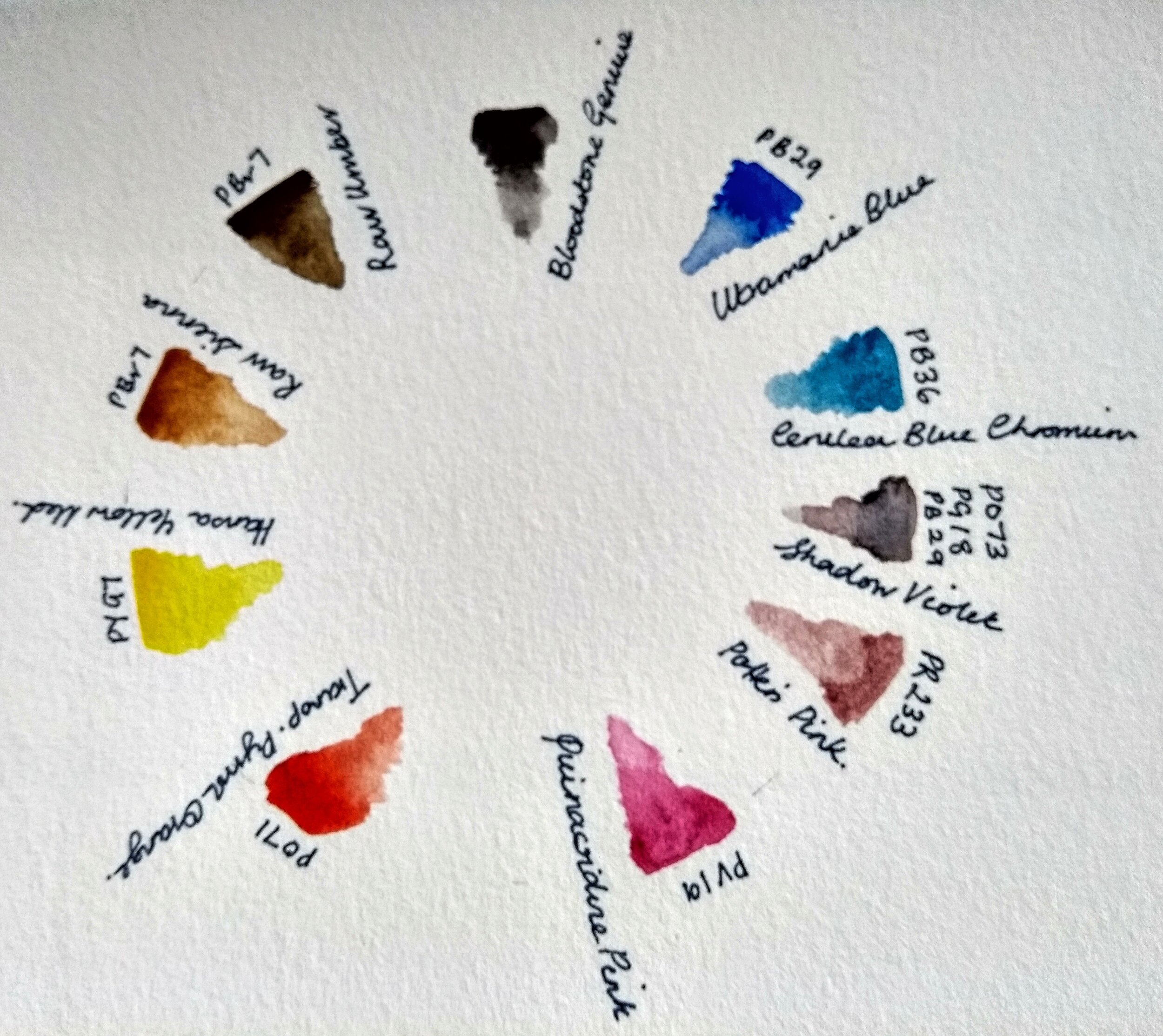
There’s also a dab of white gouache on the palette.
I normally use a limited palette because I prefer to mix my own colours, and I like single pigments. You’ll see I’ve given the pigment numbers, not just the colour names. In a nutshell, when you buy paint you can’t just go by a name to know what the colour will be in the tube. This is because the same pigment is called one thing by manufacturer A, another by manufacture B, and so on. It may also be treated differently in each manufacturing process!
It’s not a particularly vibrant set of pigments, but it does give me a good range for mixing colours. I loooove granulating pigments (another reason I prefer a textured, rather than smooth surface in my journal!) They’re really useful for painting natural subjects.
The best advice I ever had about supplies was, ‘if you find you love sketching, and resources are limited, buy less, but get the best you can afford’. That’s what I did for years, and I still have my original set of Winsor & Newton Artists watercolour pans from 1998, which I use occasionally.
I’d also say, after years of searching, it’s better to spend more money on the surface you work on, rather than the media you use. A good surface that suits your hand, makes so much difference.
Oh, and do try sketching your kit. It’s fun!